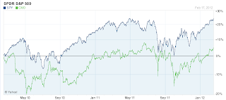
Take a look at the following chart from Yahoo Finance. In it is a relative price comparison between SPY (SP500 Exchange Traded Fund) and CMO (Capstead Mortgage). What does it tell you? What it tells me is that the price of SPY has gone up nearly 25% over the past 2 years, while the price of CMO has gone up about 5%. If one didn't know any better, you would think that SPY was a better investment than CMO. What this, and virtually every other chart you see at Investing sites on the web is missing is the effect of dividends on your investments. Only after you factor in dividends and other corporate actions can you fully understand which of CMO and SPY was the better investment.
To study and demonstrate this I put together an Historical Price Comparison workbook through Google Docs. The following details the steps I went through to accomplish this.
Step 1 - Get Data and Perform calculations
I created a Data worksheet where all of my data access and calculations are to be performend. To get the requisite data, Yahoo Finance has a nice utility for downloading both historical prices for a stock as well as dividend payments details. A sample url for this data is as follows:
http://ichart.finance.yahoo.com/table.csv?s=SPY&d=1&e=18&f=2012&g=d&a=0&b=29&c=1993&ignore=.csv
The following are the parameters and their descriptions for this call:
s- symbol
e - end day
d - end month
f - end year
a - start month
b - start day
c - start year
g - optional parameter that you can use to request just dividends (g=v)
To access this data I leveraged the ImportData function in cell a2 for the first symbol, and in cell m2 for the second symbol. The url's that are leveraged in these function calls are built from the start date defined in the Historical Price Comparison worksheet as well as the two symbols that are defined there.
I leverage two additional ImportData calls in cells y2 and aa2 in order to get dividend information for the specified symbols. The results returned are the ex-date of the dividend as well as the dividend amount.
In order to build my comparison chart that includes dividends, I decided to define an initial investment amount (100,000) as the default, and then calculate how many shares that would purchase for me on the start date. On top of that I assumed that all dividends would be reinvested on their ex-div date. (Note exactly right as you would only be able to reinvest the dividends the day after the payment date, but hopefully close enough to prove a point here.)
In order to derive the initial and subsequent shares after reinvesting dividends, I leveraged the following function in column H (copied from cell h3:
IF($A3='Historical Price Comparison'!$H$1,('Historical Price Comparison'!$E$1/$E3),If(Isnumber($I3),($H4+($I3*$H4)/$E3),$H4))
What this formula does is the following:
if the price date equals the starting date, then the numbers of shares is equal to the initial investment value divided by the closing price. It also checks to see if a dividend was paid on that date, and if so it adds the reinvested dividends (in terms of shares purchased) to the number of shares that were held on the previous date.
To determine the div amount in column i I used the vlookup() function to pull in the dividend value from column Z or AB where the dividend date equals the price date.
The market value (column j and v) was calculated simply by multiplying the number of shares by the closing price for the given date.
I also calculated the market value without dividends applied in columns x and l by simplying multiplying the close price by the shares held, but the shares held did not include the effect of reinvested dividends. I did this so as to be able to compare the effect of reinvesting dividends on the market value.
Step 2 - Creating the visuals
The Historical Price Comparison sheet does nothing more than reference the appropriate cells in the Data worksheet, and then in turn graphs the results.
The graph includes four line charts for the two symbols. One line shows the market value with reinvested dividends, the other shows it without. The following is the result. As you can see, with reinvested dividends CMO was a better purchase than SPY.
When using this sheet you need to ensure that your start date is a valid trading date. So, no weekend dates and no holidays. (I probably could have put the validation logic in there, but, figure my time is best spent else where.)
This spreadsheet can be accessed here:
https://docs.google.com/spreadsheet/ccc?key=0Aj8CeiznlFexdEVrLXlQLTdTUF9HOGgwd1UyTnJMM0E
You can also search for it in the template section here:
Take a look, and let me know what you think.

No comments:
Post a Comment